CONTEXT
8 million people in Germany live with their diabetes daily.
Most apps treat this as a data problem, not a human one.
Nouri is a genuine attempt to understand why dietary adherence fails, and to design a system that makes it easier to succeed.
Impact metrics
0%
found meal planning easier
0
weeks concept to prototype
0+
age range designed for
0
competitor gaps closed
PROBLEM
A daily paradox.
The dietary decisions that most affect patients’ health are the ones they feel least equipped to make.
Dietary complexity overwhelms
Every meal requires cross-referencing GI, portion, and cultural preference simultaneously.
Doctor connection is broken
Daily diet management and clinical care exist in completely separate worlds.
60+ users are excluded
Existing apps fail elderly patients through small touch targets and interface density.
No real-time GI awareness
Meal planning happens with zero blood sugar impact data.
HOW MIGHT WE
Reduce the daily cognitive burden of dietary management for diabetes patients, while keeping them meaningfully connected to their healthcare providers?
RESEARCH
12 patients.9 rounds.Real findings.
12
diabetes patients interviewed
(Type 1 & 2, ages 35–74)
3+1
doctors and nutritionist
validating every decision
4
testing rounds from
paper prototype to hi-fi

"I know what I should eat. I just can't figure out what to actually cook every day."
— Michael, 35, Type 2 (at risk)

"I find these apps confusing. The buttons are too small and there's too much going on."
— Margaret, 65, Type 2

"My doctor sees me once a month. What I eat every day, he has no idea."
— Ahmad, 74, Type 2
Cognitive overload, not lack of motivation, was cited by every patient as the primary reason dietary plans fail.
Users 60+ abandoned every app tested due to interface complexity, not disengagement from their health.
The doctor relationship was entirely absent from every competing product in the category.
We analysed the four most-used competing apps against our core design criteria.
No existing app combines AI meal planning, GI awareness, doctor integration, and accessibility for 60+ users in a single product.
DESIGN DECISIONS
4 choices that shaped the design.
Decision 1
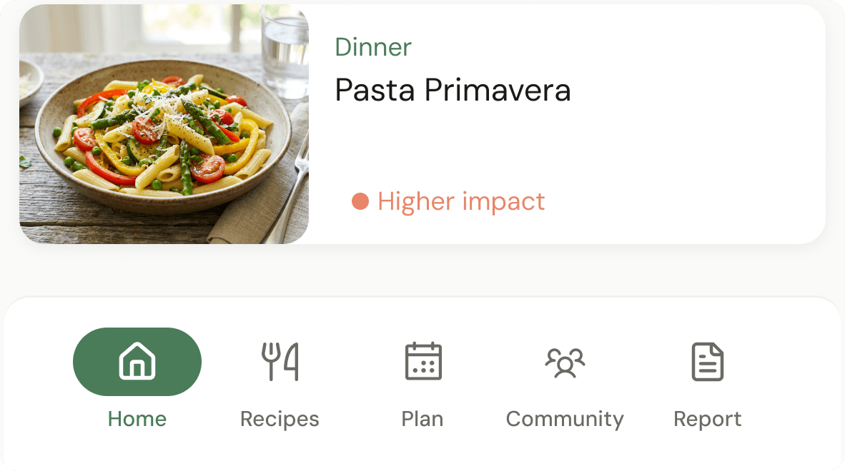
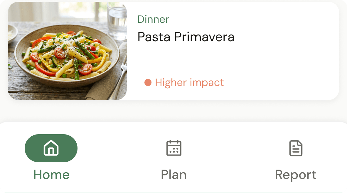
Accessibility-first navigation over feature density
3-item bottom nav with icon + label pairs and 60px touch targets, exceeding the 48px WCAG minimum; instead of the 5-item hamburger used by every competing app.
3 nav items maximum
Testing showed users 55+ took 3× longer with 5+ items. Zero navigation failures in final testing.
Icon + label pairs always
Icons alone caused ambiguity for elderly users in every paper prototype round.
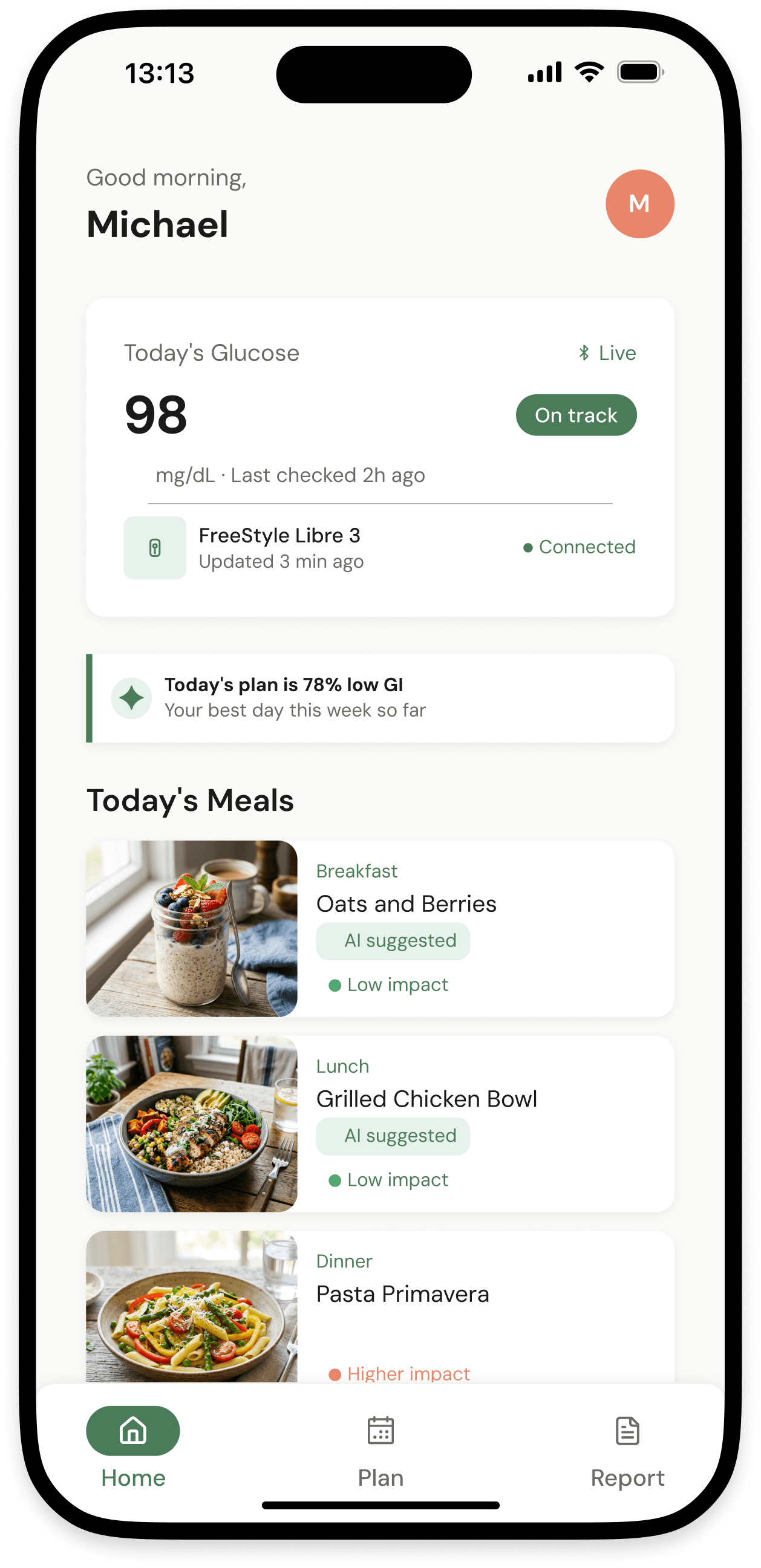
RESULT
0 navigation failures among 60+ users in final testing vs. 60% failure rate on competing apps.
Decision 2
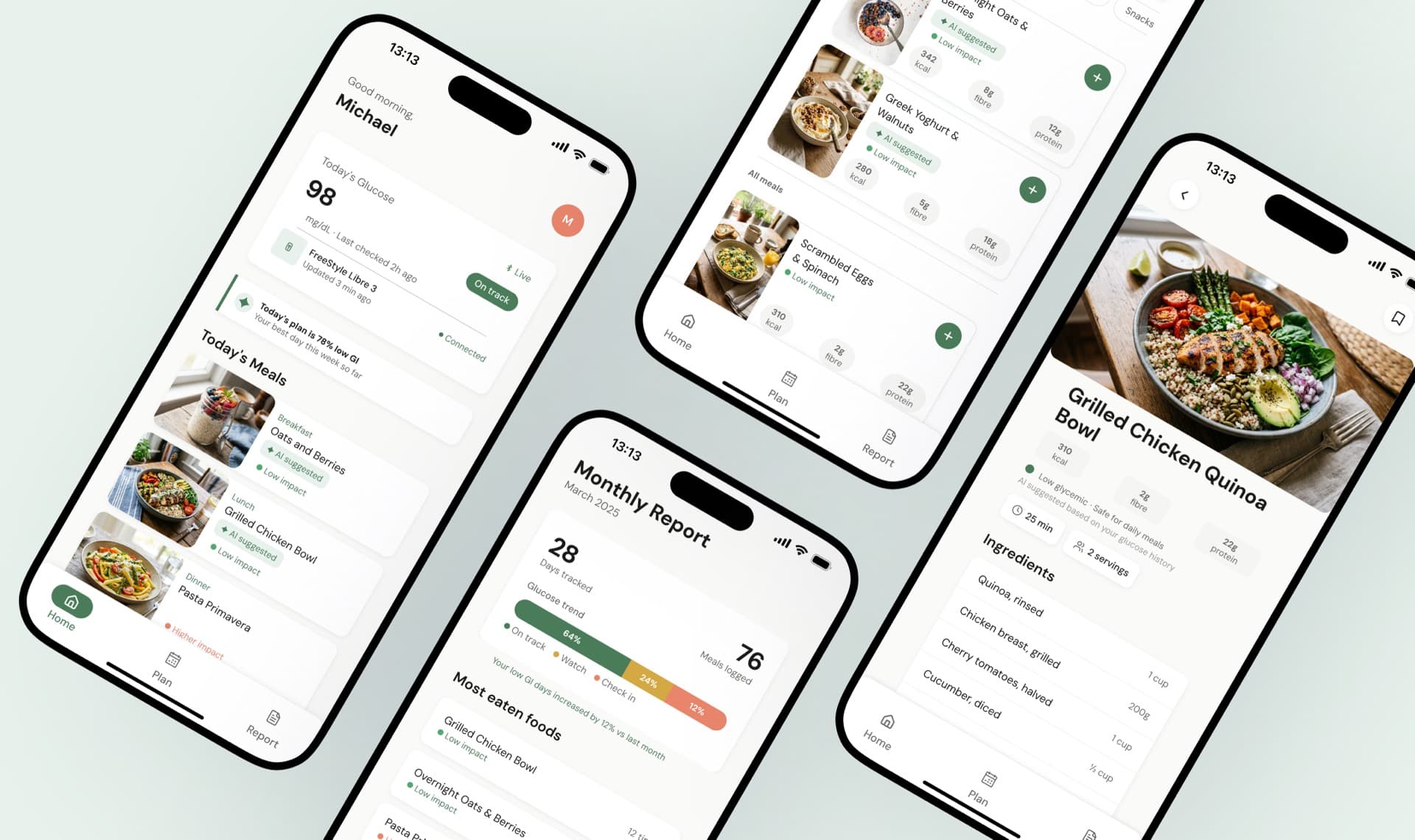
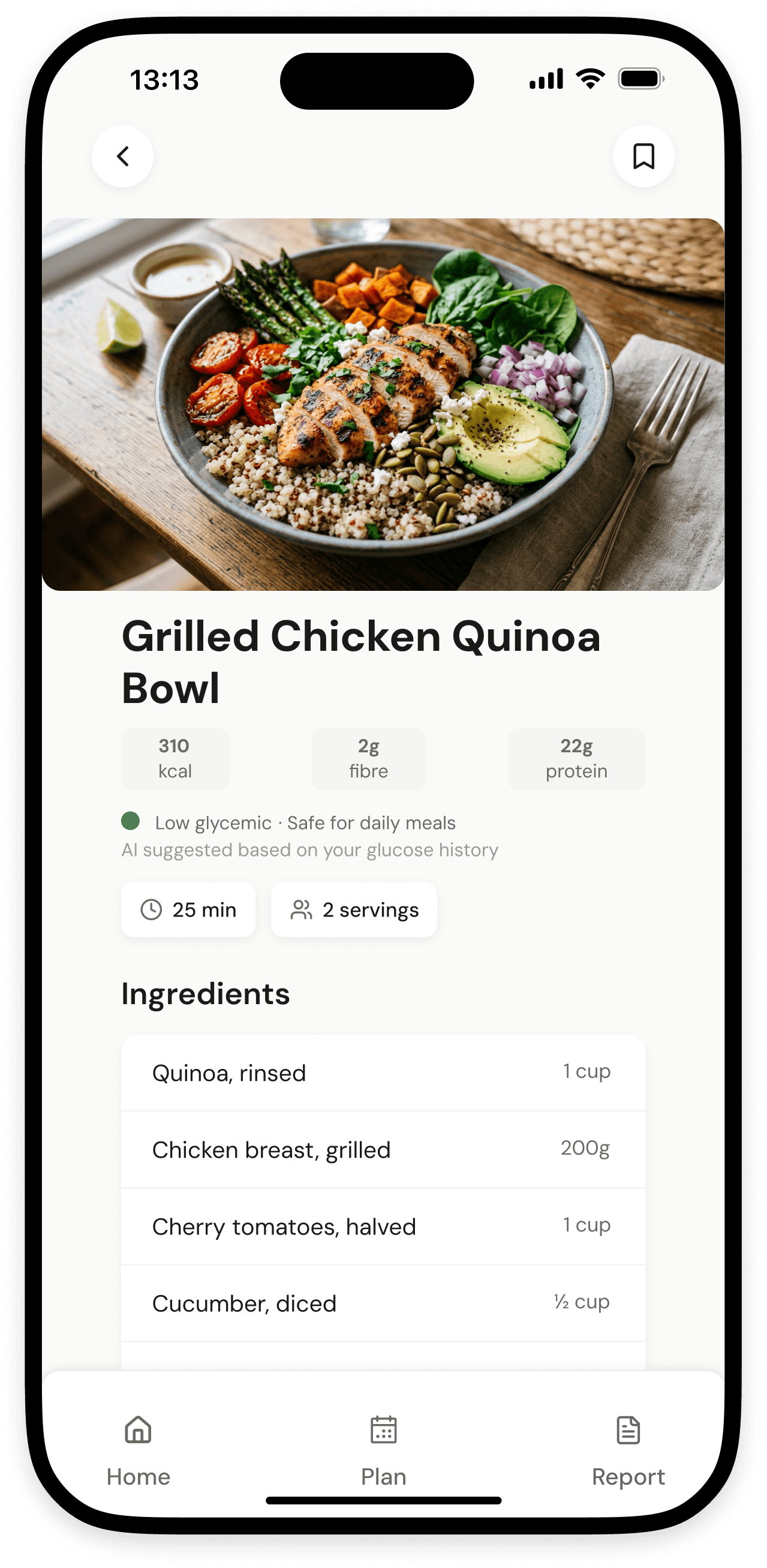
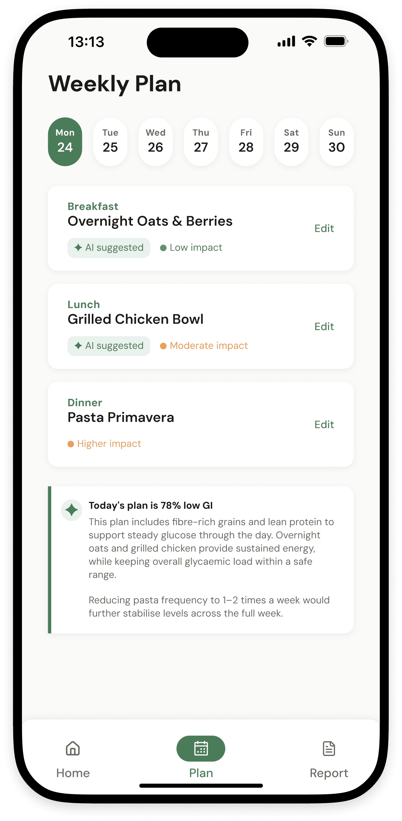
Glycemic index as a visual signal, not a number
A 3-colour system (green / amber / red dot) on every recipe instead of raw GI scores, because 8 of 10 users could not interpret a raw number without explanation.
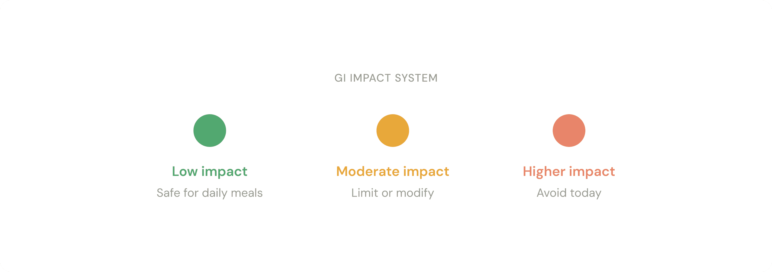
Green dot = safe (low GI)
Users associated green with safety without any onboarding. The signal was universally understood.
Amber dot = limit or modify
Nutritionist confirmed directional signals are more actionable than absolute numbers for patients.
RESULT
All 12 participants correctly identified low / high GI meals within 3 seconds. Zero training needed.
Decision 3
Doctor feedback loop built into the core flow
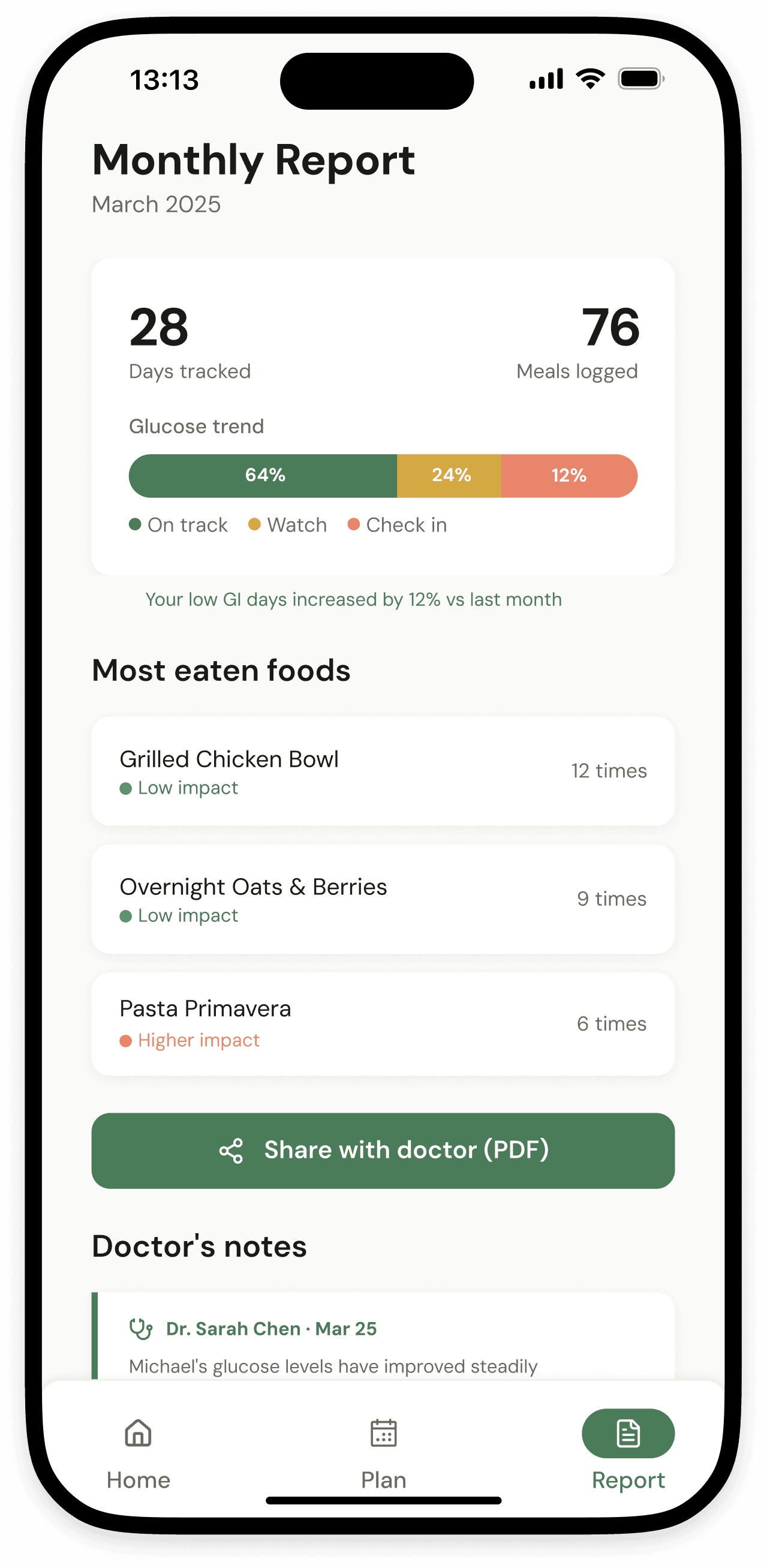
Monthly PDF export with a dedicated doctor comment section, not real-time messaging, which doctors confirmed they could not operate as on-demand responders.
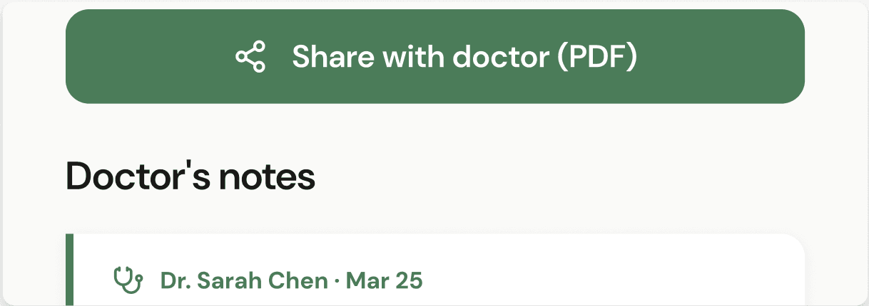
Monthly PDF, not real-time chat
Doctors confirmed they cannot operate as on-demand responders. Async export matches how clinical care actually works.
Doctor comment section in report
Patients see their doctor's notes directly in the app, connecting the two worlds for the first time.
RESULT
Both doctors stated the report format would improve consultation quality. Feature added after round 1 of stakeholder testing.
Decision 4
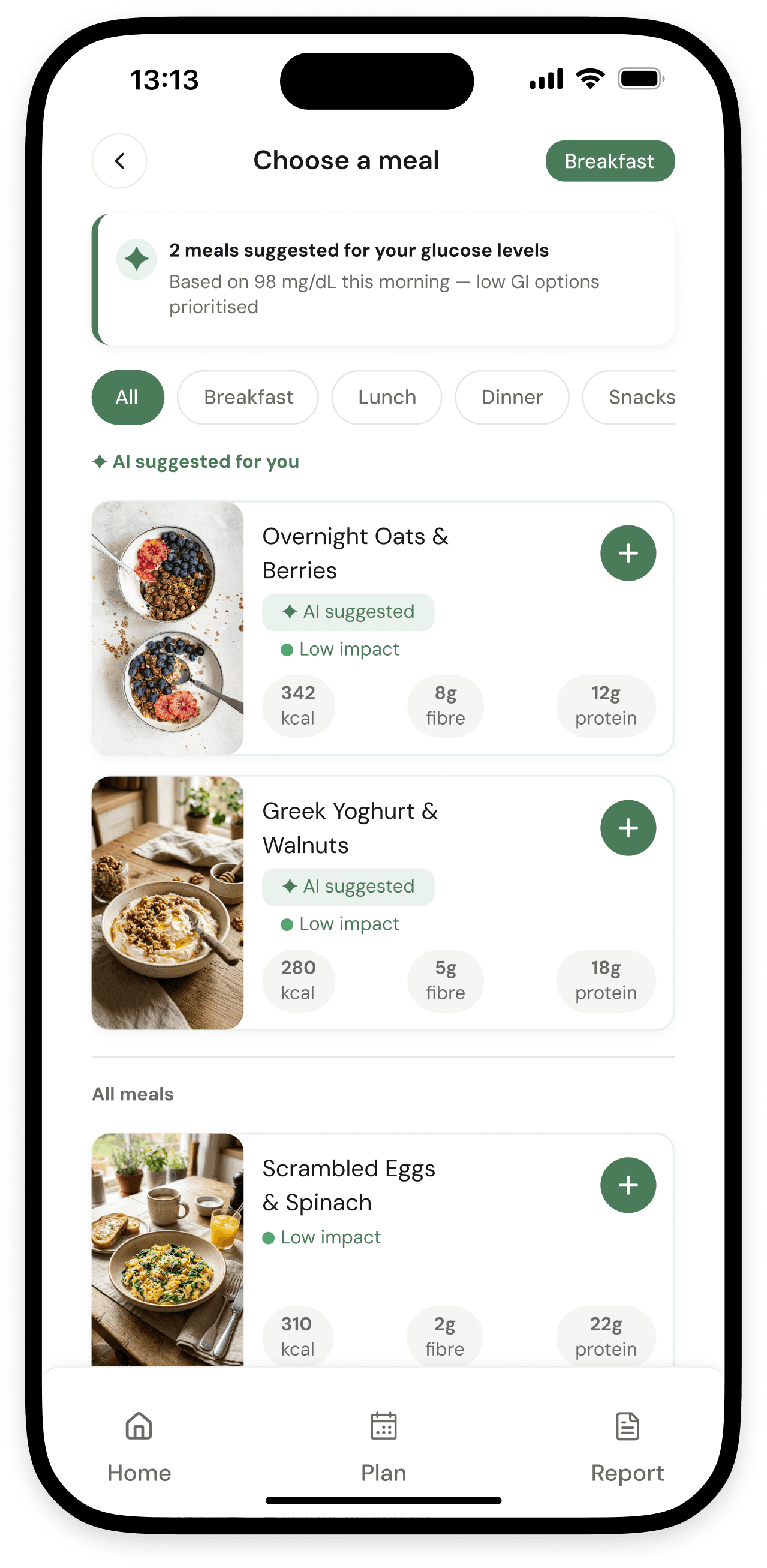
AI-generated meal planning over manual tracking
A personalised daily meal plan generated by AI based on each user's diabetes type, age, glucose history, and food preferences; updated every morning without the user having to think about it.
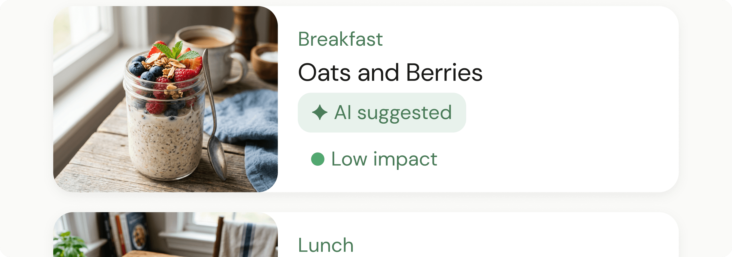
“AI suggested” chip on every meal card
Making AI visible but unobtrusive builds trust, especially with older users who are sceptical of automation they cannot see or override.
Contextual daily GI insight, not a dashboard
When the day’s plan is complete, the AI surfaces one plain-language insight. No charts, no numbers, no cognitive load.
RESULT
AI suggestions reduced the average meal selection time from ~8 minutes to under 2 minutes across 10 participants. 9 of 12 said they would trust the AI suggestions.
ITERATIONS
What testing revealed.
Round 1: Navigation
5-item hamburger nav
What didn't work
60% task failure rate among 60+ users
Community tab was rarely discovered
Elderly users abandoned within first session
→
3-item bottom nav
What worked
Zero navigation failures in final round
All core functions reachable in 1 tap
Community content surfaced in Home feed
Round 2: Onboarding
7-screen onboarding
What didn't work
Users felt interrogated before seeing any value
High abandonment before reaching home screen
Reported feeling overwhelmed in user tests
→
3-screen onboarding
What worked
Age, diabetes type, weight only, upfront
Remaining preferences collected progressively
Onboarding completion improved significantly
Round 3: Glucose card redesign
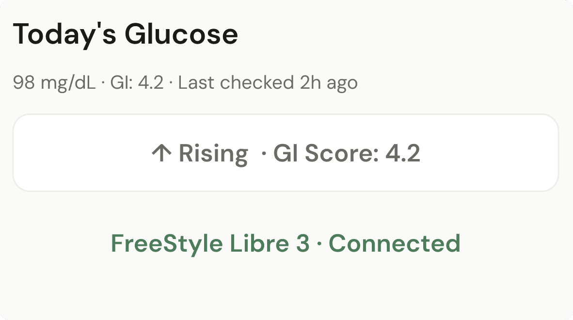
Raw number display
What didn't work
8 of 10 users couldn't interpret mg/dL without clinical context
Elderly users ignored the number entirely, looked for labels
No connection between glucose reading and meal decisions
→
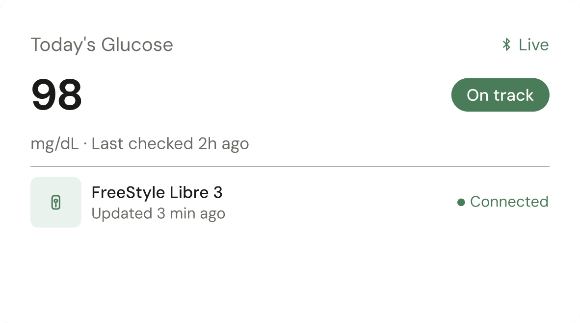
Plain language status system
What worked
All 12 participants understood "On track" within 3 seconds
Status pill directly linked to meal confidence decisions
Zero comprehension failures in final testing round
FINAL DESIGNS
The screens that shipped.
OUTCOMES
Results
8/8
task completion
in final testing
0
navigation failures
among 60+ users
74%
rated meal planning
significantly easier
4
rounds of testing
conducted
All 8 final usability participants completed the full task flow without assistance. Zero navigation failures among users aged 60+. Doctors confirmed the export format would improve consultations.
REFLECTIONS
Three honest takeaways.
What I learned
Accessibility should be the starting constraint, not a post-design check. I began treating it as an optimisation, by mid-project it became clear it was the core design problem. Every major decision on this project was ultimately an accessibility decision in disguise.
What I'd do differently
Push the doctor integration feature earlier. The research signals were there from interview round 1, but it wasn't prioritised until round 2. More testing rounds on the most differentiated feature would have strengthened the case study and the product significantly.
What surprised me
The competitive gap was larger than expected. No existing app addressed the doctor relationship at all, not even partially. That gap became the strongest argument for Nouri, and it came entirely from user research, not assumption.
Prototype
See it in action
Explore the interactive prototype in Figma.