THE GAP
Every competitor went mobile. Every competitor got it wrong.
Every tool in this space is either a banking app or an accounting platform. They show transactions. None of them answer the question every German freelancer asks at the end of every month: after tax, after expenses, what is actually mine? Klarr is not a bank. It is the layer that makes your bank finally make sense.
Kontist
Shows tax estimate
No picture of real take-home after expenses
Qonto
Business account
Transactions only. No clarity layer.
Lexoffice
Accounting software
Built for accountants, not freelancers
Holvi
Banking + invoicing
Mobile-first. Serious work happens at a desk.
ELSTER
Tax filing
Requires a degree to operate. No live guidance.
The gap isn’t a missing feature. It’s a missing perspective. Every tool optimises for transactions. Klarr optimises for clarity.
WHO IT’S FOR
Two personas. One shared problem.
Different backgrounds, different blockers. The same anxiety at the end of every month: what is actually mine?

Invoices 3–5 clients per month at irregular amounts
Has been surprised by a Finanzamt tax bill twice
Uses N26 as her business account with no tax tracking
“I earn well. I just never know how much of it is actually mine.”

Invoices 4–6 clients per month across different project sizes
Has received two unexpected Finanzamt tax bills with no prior warning
No tool he has tried works in English with German tax logic
“I didn't expect taxes to be the biggest barrier to freelancing in Germany.”
Tax anxiety crosses language and background — Jim and Maya share the same dread despite different situations.
Existing tools were abandoned due to complexity, not lack of intent.
No tool in the German market connects income, expenses, and tax into a single real-time number — in English or German.
DESIGN DECISIONS
Four decisions that define what Klarr is, and what it deliberately chose not to be.
Decision 1
Desktop-first when every competitor went mobile
Every competitor in this space is mobile-first or mobile-only. The assumption is that freelancers manage money on their phone. The reality is different: serious financial decisions (quarterly tax reviews, invoice reconciliation, expense categorisation) happen at a desk, not on a commute. Klarr was designed for that moment of deliberate attention.
RESULT
Desktop layout allows the 'yours' number to be the undeniable hero of the screen, something impossible to achieve in a mobile card stack. Every layout decision flows from this single constraint.
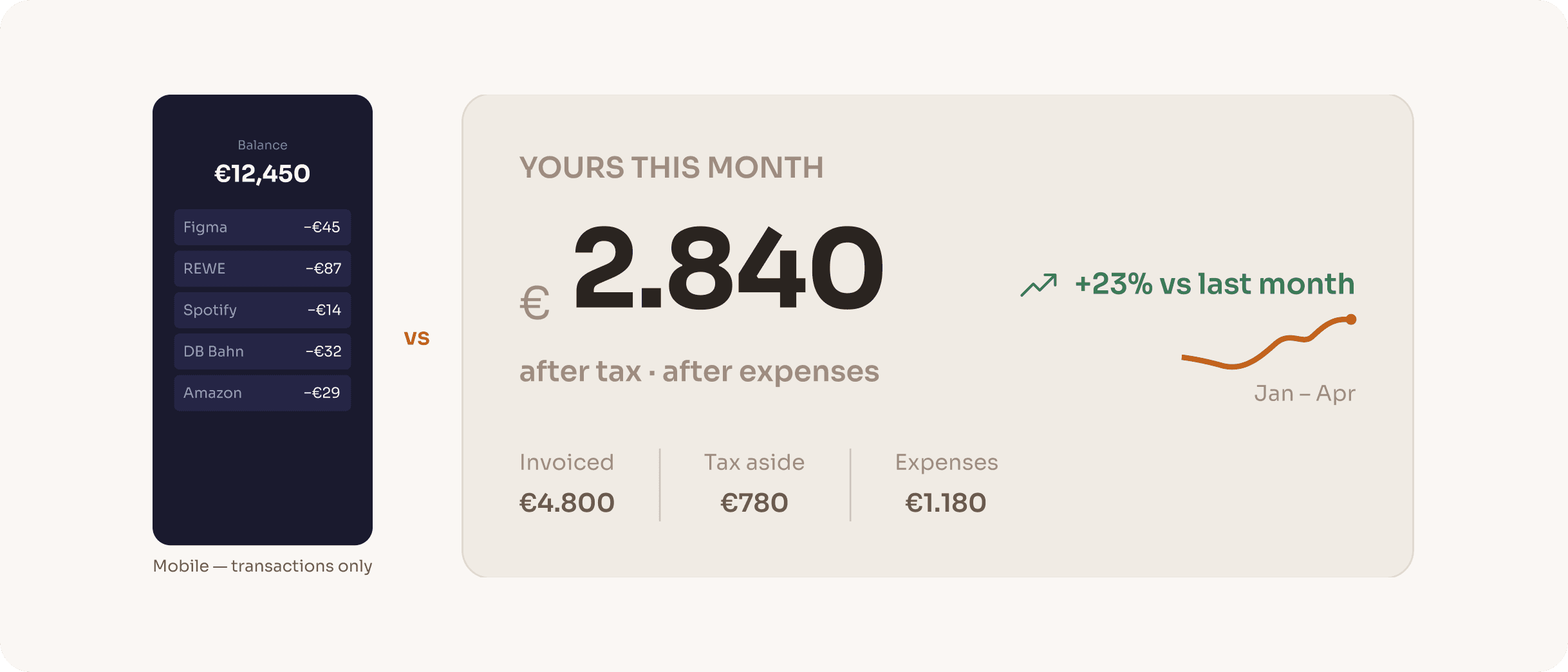
Decision 2
One number over every number
Early concept explorations showed a full financial dashboard: revenue charts, expense breakdowns, tax timelines all visible simultaneously. Every version felt overwhelming. The insight was that freelancers don't need more data; they need one answer. The entire information hierarchy was rebuilt around a single output: what you actually keep this month, after everything.
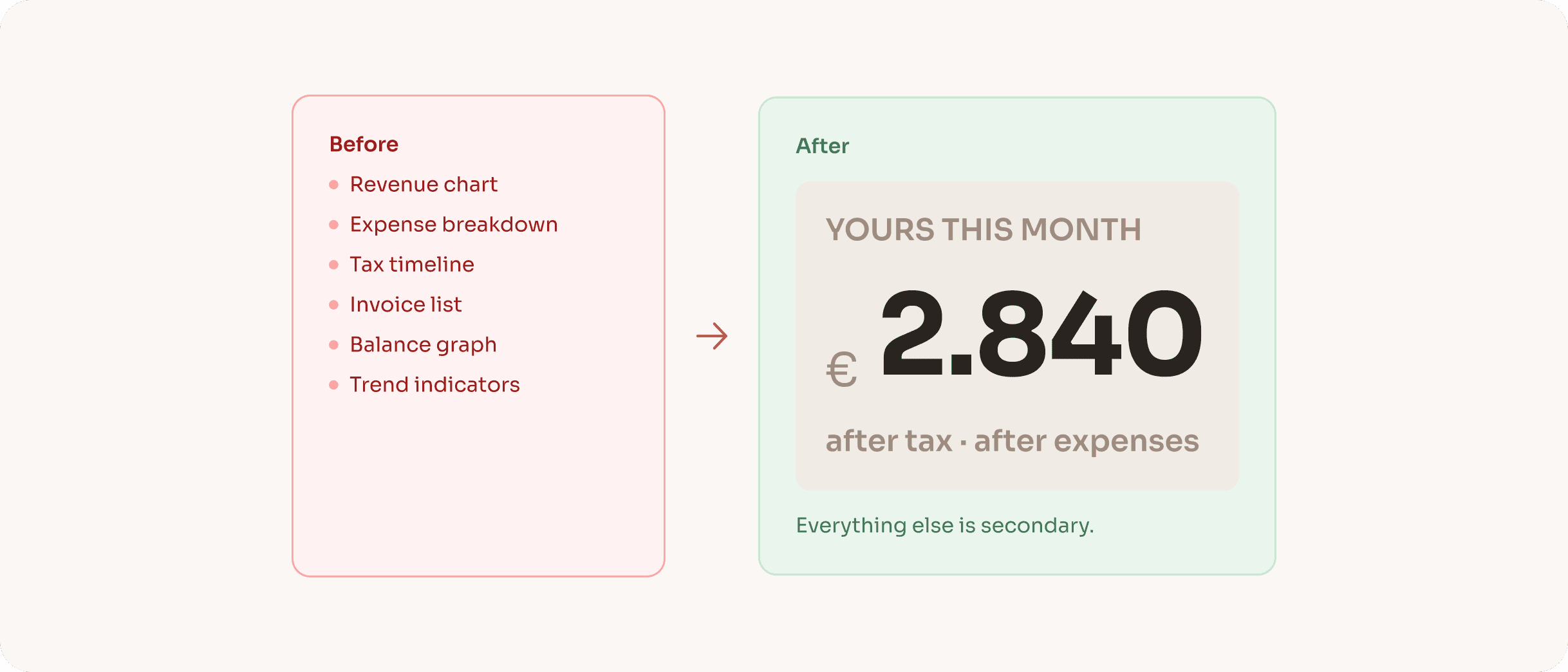
RESULT
The 'YOURS THIS MONTH' hero card became the product's north star. Every subsequent design decision was evaluated by one question: does this support or compete with that number?
Decision 3
Filled vs outlined CTAs encode action type, not hierarchy
Most products use filled buttons for primary actions and outlined for secondary. Klarr uses a different logic: filled buttons commit data inside the product (New Invoice, Log Expense, Save Changes), outlined buttons trigger external processes (Sync Bank, Export PDF, Change Photo). Users learn this pattern once and it applies everywhere: clear consequence signalling, no visual noise.
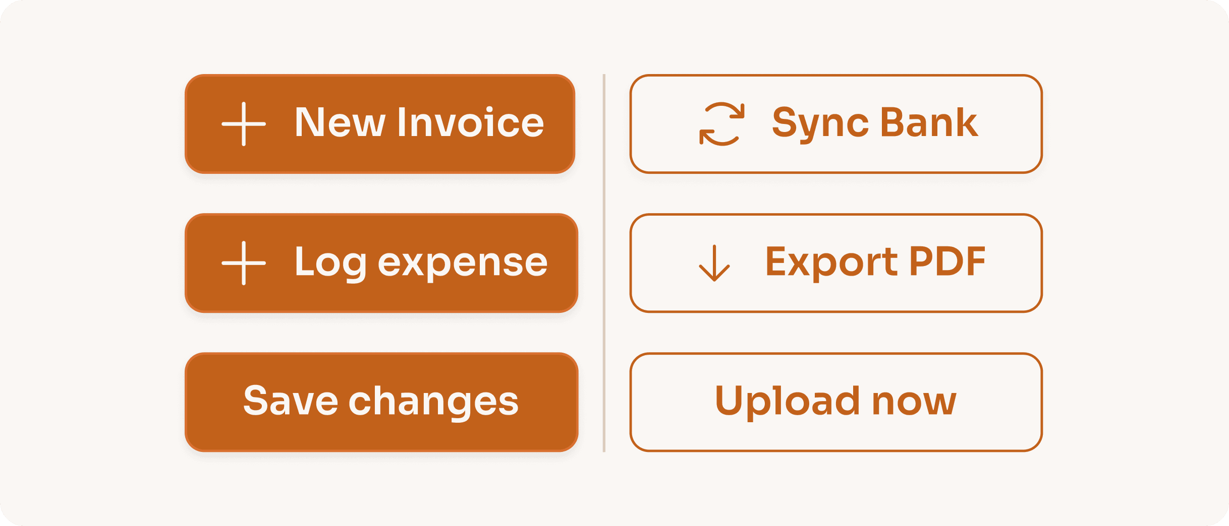
RESULT
The pattern removes the need for confirmation dialogs on most actions. When the visual treatment already signals 'this stays inside Klarr,' users act with more confidence and less hesitation.
Decision 4
Deductibility encoded in expense bar colour
Standard expense charts use a single colour for all bars, or assign colours randomly by category. Neither conveys anything useful. Klarr encodes tax deductibility directly into the bar colour: green for fully deductible, amber for partially deductible (Client Meals at 70% under German tax law), blue for travel. Users read their tax position without reading a single number.
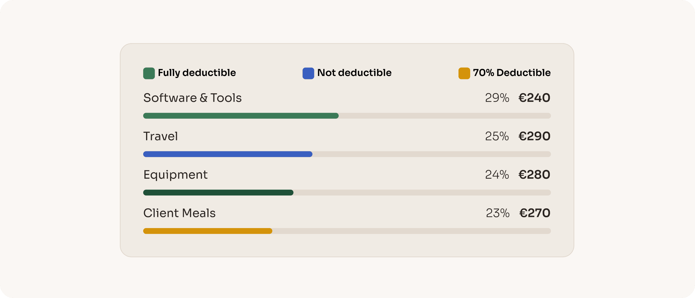
RESULT
This decision is unique to Klarr in the German market. No competitor visualises deductibility in the expense chart. It turns a passive data display into an active tax decision support tool.
ONBOARDING FLOW
Seven steps. One clear picture.
Seven steps that turn a generic dashboard into a financial picture calibrated to this specific person’s tax situation. The onboarding is where Klarr becomes personal.
Welcome
Name, email, password. The only screen that could belong to any product.
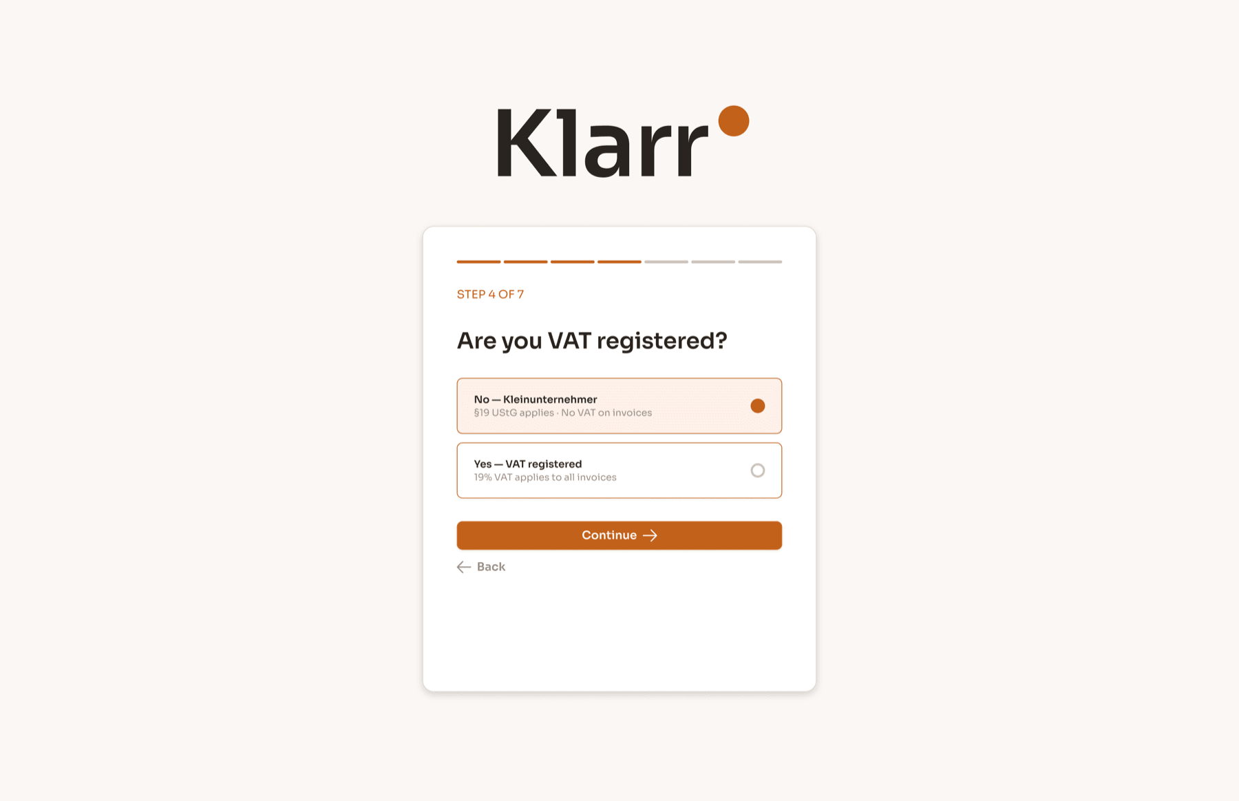
Work type
Freiberufler or Gewerbetreibender. This single question determines whether trade tax applies, a significant calculation most tools ignore.
Steuerklasse
Tax classes I–VI. A married freelancer in Steuerklasse III keeps dramatically more than a single person in Steuerklasse I on identical income.
VAT status
The Kleinunternehmer branch (§19 UStG) means no VAT on invoices. The VAT branch means 19% of every invoice is never theirs.
Family situation
Single, married, dependents. Kinderfreibetrag allowances affect the tax calculation meaningfully.
Connect bank
PSD2 Open Banking. The user picks their bank and authenticates once. Klarr reads from that point forward.
First categorisation
The last 10–15 transactions are sorted into Business or Personal. Klarr learns the pattern. The dashboard loads with a real number for the first time.
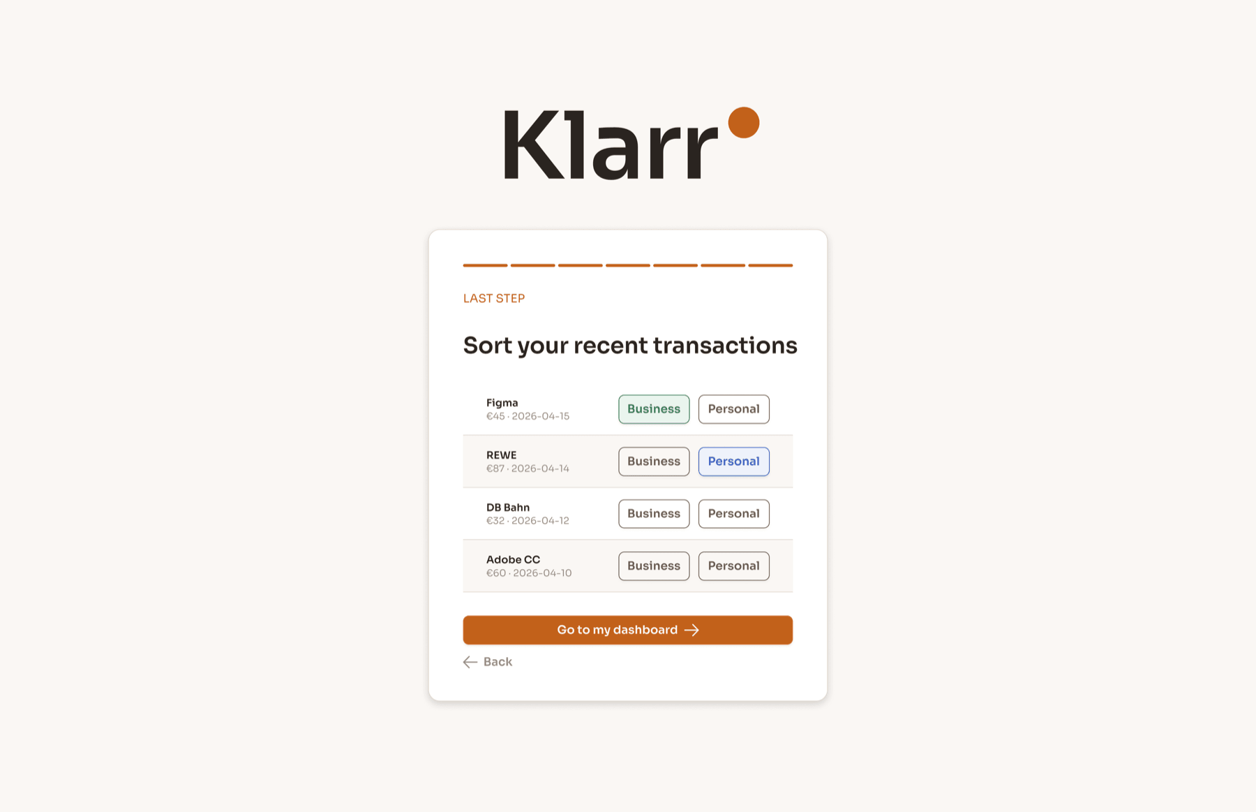
By the end of step seven, Klarr knows more about the user’s tax position than any other tool they’ve ever used. The number on first load is real: not a demo, not an estimate.
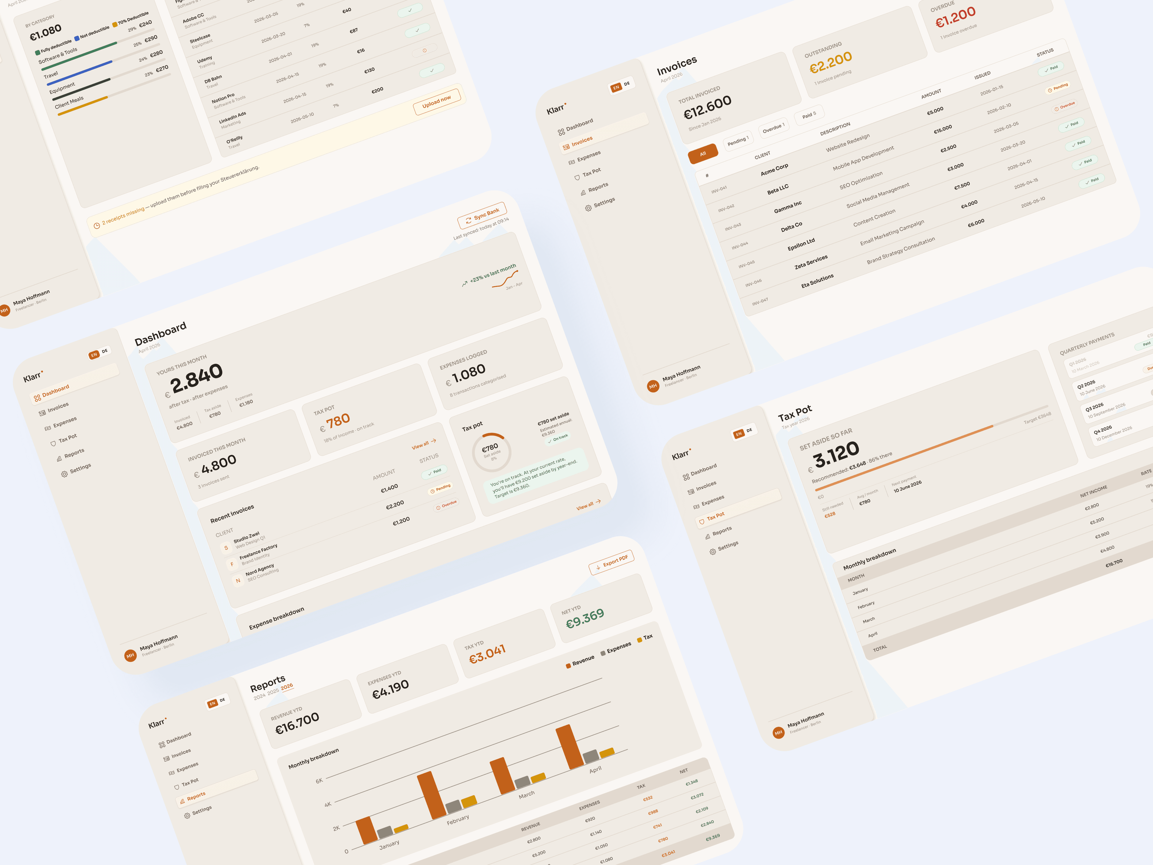
FINAL DESIGNS
Five screens that replace three separate tools.
Each answers a different financial question. Together they replace three separate tools.
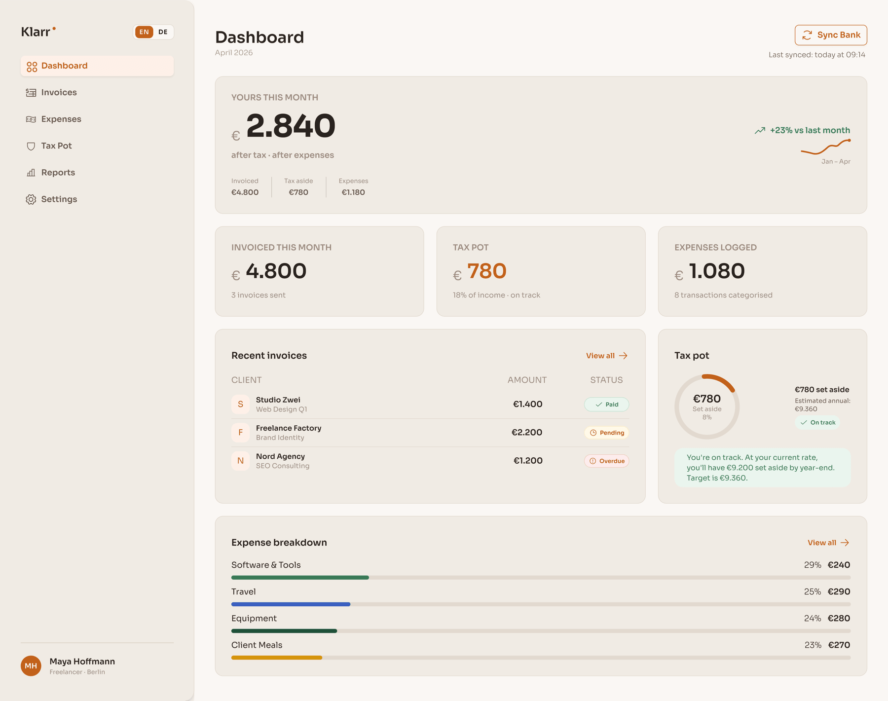
The 'yours' number as the undeniable hero. Every other element is subordinate. The sparkline shows trend without demanding attention.
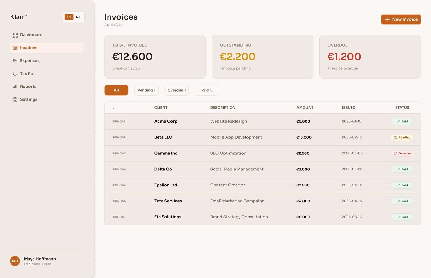
Full invoice lifecycle in one view. Paid, Pending, Overdue: status is immediate without opening anything.
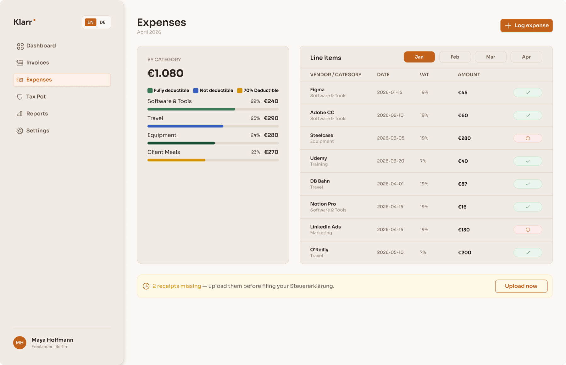
Deductibility encoded in bar colour. The legend teaches the system once. The missing receipts banner surfaces the one action that protects against a Steuererklärung problem.
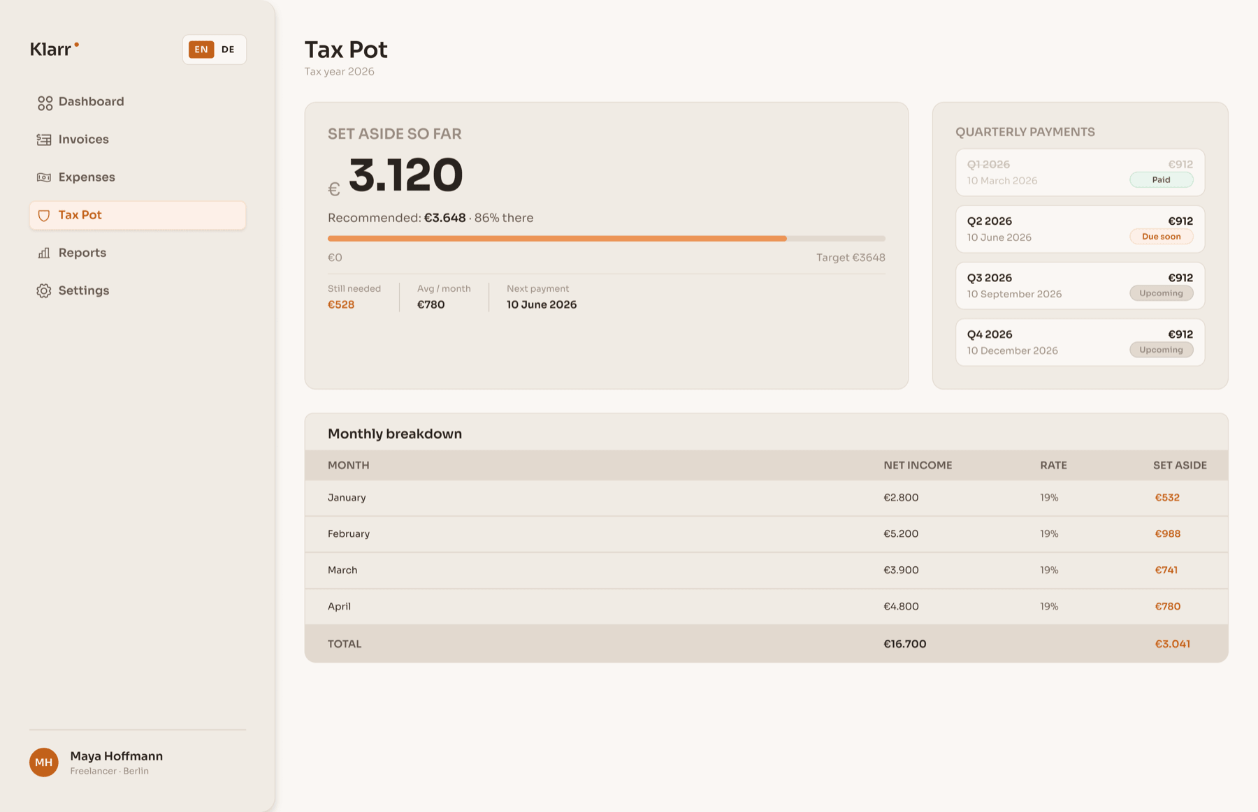
The progress bar answers the anxiety question: am I on track? The quarterly payment timeline removes the Finanzamt surprise every German freelancer dreads.
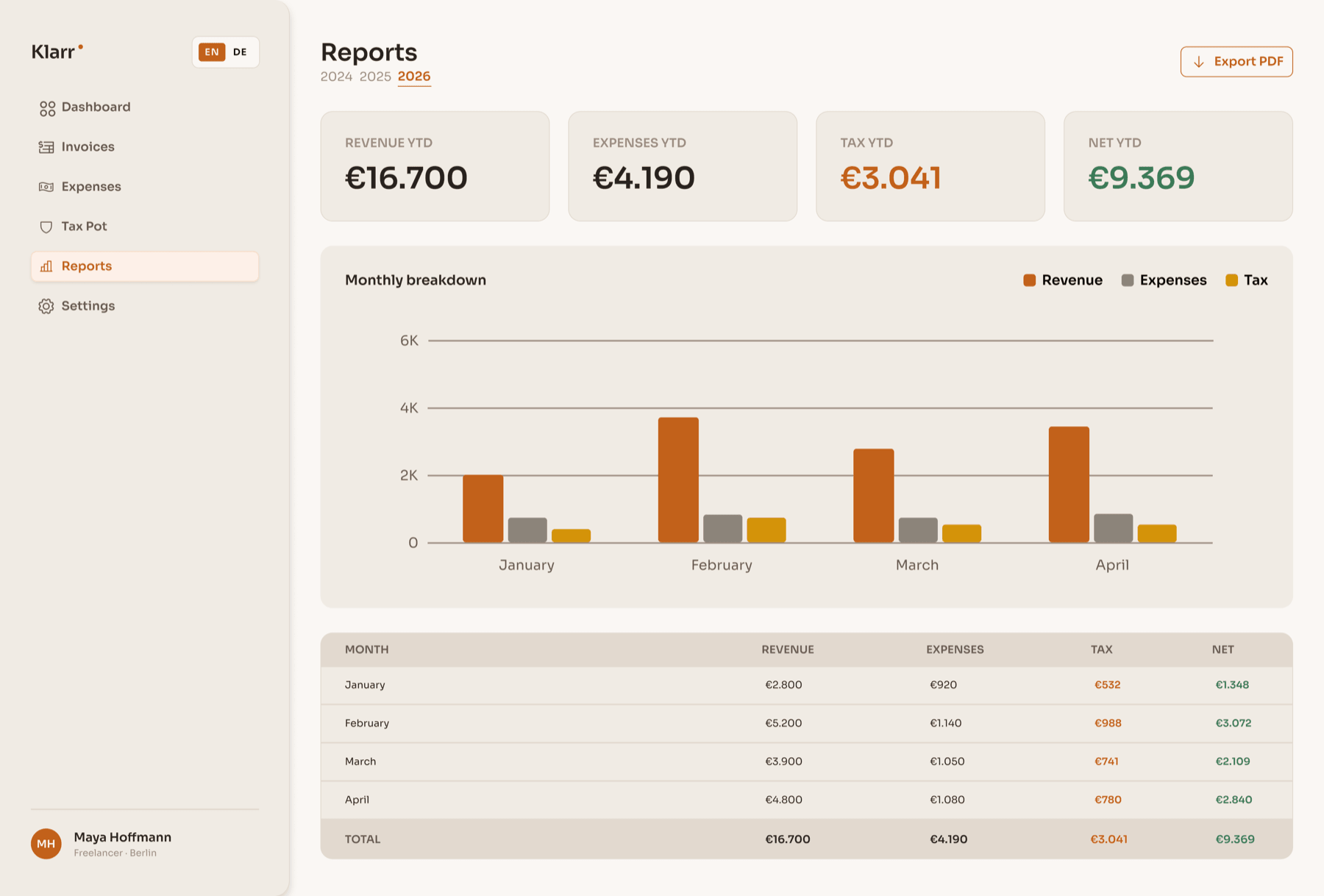
Year-selectable summary formatted for a Steuerberater or ELSTER export. The bar chart and data table are print-ready.
REFLECTIONS
Two honest takeaways.
What worked
Starting from the concept rather than the screens gave every decision a rationale. The ‘yours’ number as north star meant any cluttered layout had one resolution question: does this compete with the number? The warm colour system was also the right call, immediately distinct from every cold-toned competitor in the space.
What I’d do differently
I’d test the onboarding with real German freelancers before locking the screen count. Seven steps felt right conceptually, but step four introduces a concept many new freelancers don’t yet understand, and I have no drop-off data to validate it. The empty state for users connecting a bank with no history also deserved far more attention than I gave it.
Prototype
See it in action
Explore the interactive prototype in Figma.