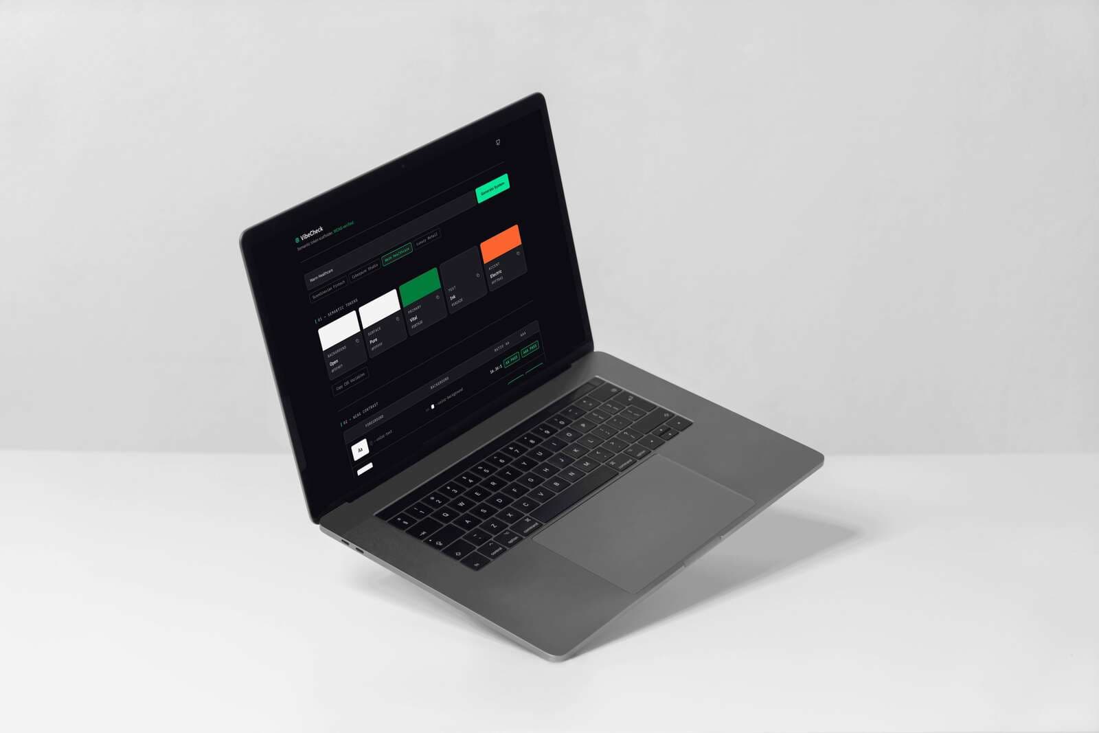
Overview
Color tools and accessibility tools are separate. Figma tells you what looks good. WebAIM tells you what passes. Nothing does both at the moment of creation, from a human starting point. VibeCheck is the missing link — describe a vibe in plain language and get a semantic token system that is both emotionally coherent and WCAG-verified. The vibe comes first. The compliance comes free.
The Problem
Every new design system starts with the same four-step failure loop.
Pick colors that feel right for the brand
Realize halfway through that text contrast fails WCAG
Manually adjust hex values, re-check, adjust again
End up with a palette that technically passes but no longer feels intentional
The root issue: color tools and accessibility tools are separate. Nothing does both at the moment of creation.
The Concept
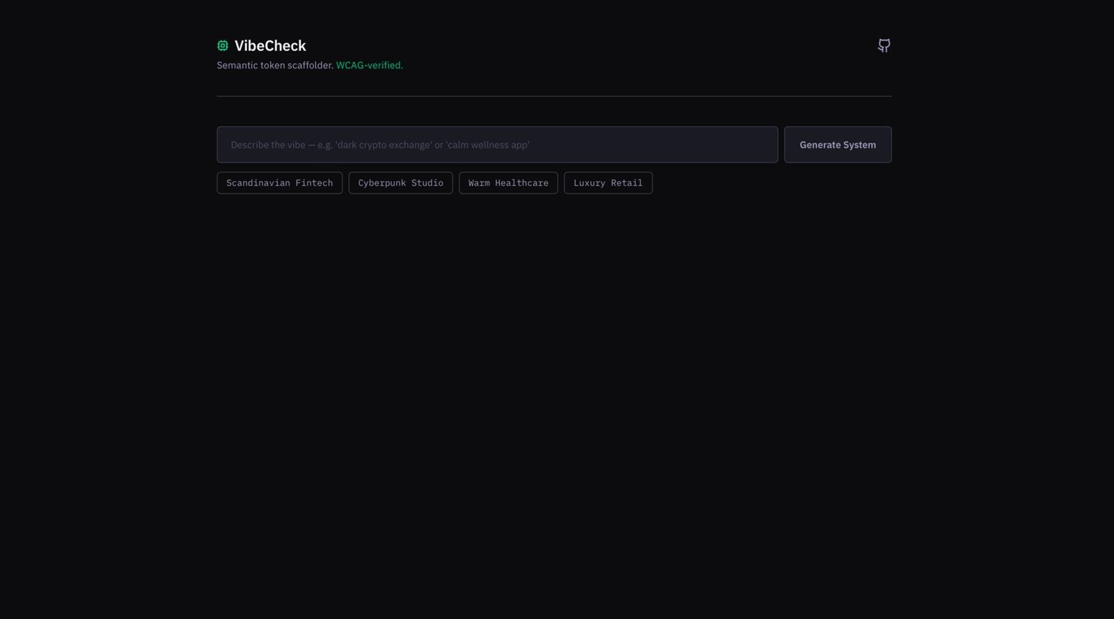
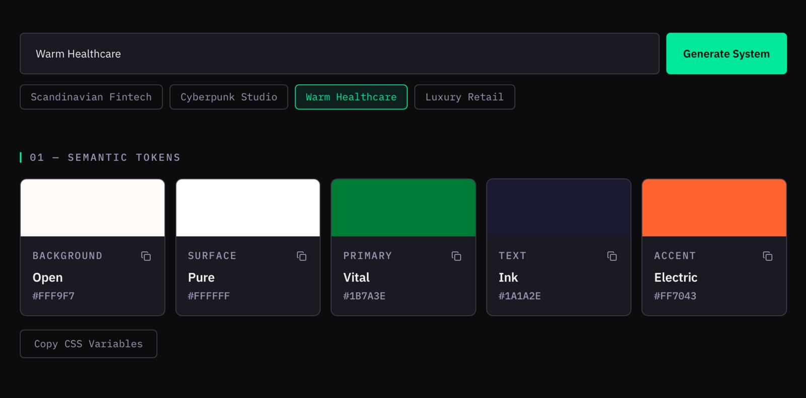
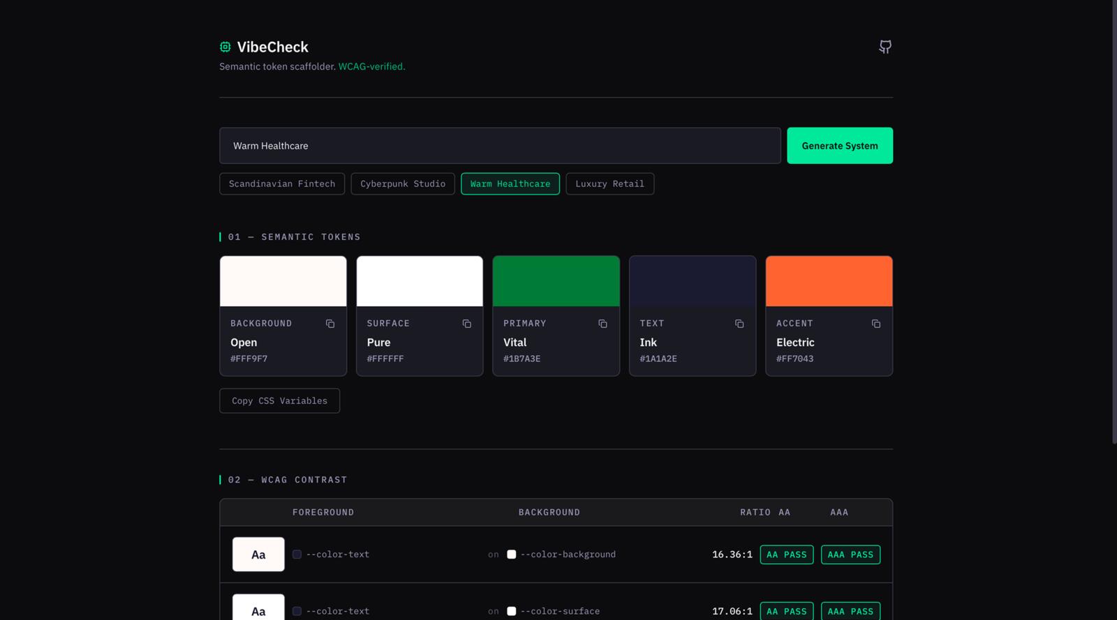
Five tokens. Two sections. One input. No settings panel. VibeCheck is deliberately minimal — it produces only the five foundational semantic color tokens every UI needs: Background, Surface, Primary, Text, Accent. Names that map to roles, not raw values.
--color-primary: #0047AB is more useful than --blue-600: #0047AB because it encodes intent. It tells the next developer — or the next AI — what the color does, not just what it is. VibeCheck scaffolds at that level of abstraction.
The constraint is the feature. Forcing five tokens forces a decision before the project starts — not after.
Design Decisions
DECISION 01
Dark-first, not dark-trendy
Dark mode exposes sloppy token work faster than light mode — it surfaces contrast failures that light mode hides. Building the tool dark-first is a statement about rigor. The tool earns credibility by demonstrating the same discipline it teaches.
DECISION 02
One accent. Five appearances.
#00E5A0 appears only on the Generate button, the active preset chip, the Pass badge, the wordmark icon, and copy-success feedback. Everything else is neutral. The accent earns its impact through restraint — when it appears, it means something.
DECISION 03
Two fonts, two purposes
IBM Plex Sans for human language — body text, labels, prose. IBM Plex Mono for machine language — hex codes, CSS variable names, contrast ratios, section labels. Every string that is a specification rather than a description gets the monospace treatment.
DECISION 04
No shadows. No decoration.
Borders do structural work. Spacing carries hierarchy. Visual weight comes from contrast and scale alone — not effects. The geometry is strict: 8pt grid, 8px card radius, 5px button radius, 1px borders throughout.
Visual System
Eleven tokens. Every value has a reason.
| Token | Value | Rationale |
|---|---|---|
| --vc-bg | #0E0E10 | Page background — deepest layer in the depth stack |
| --vc-surface | #1A1A22 | Token cards — float visibly above background |
| --vc-surface-hi | #22222C | Hover state — communicates lift and interactivity |
| --vc-primary | #E2E2F0 | Primary text — near-white, high contrast on dark |
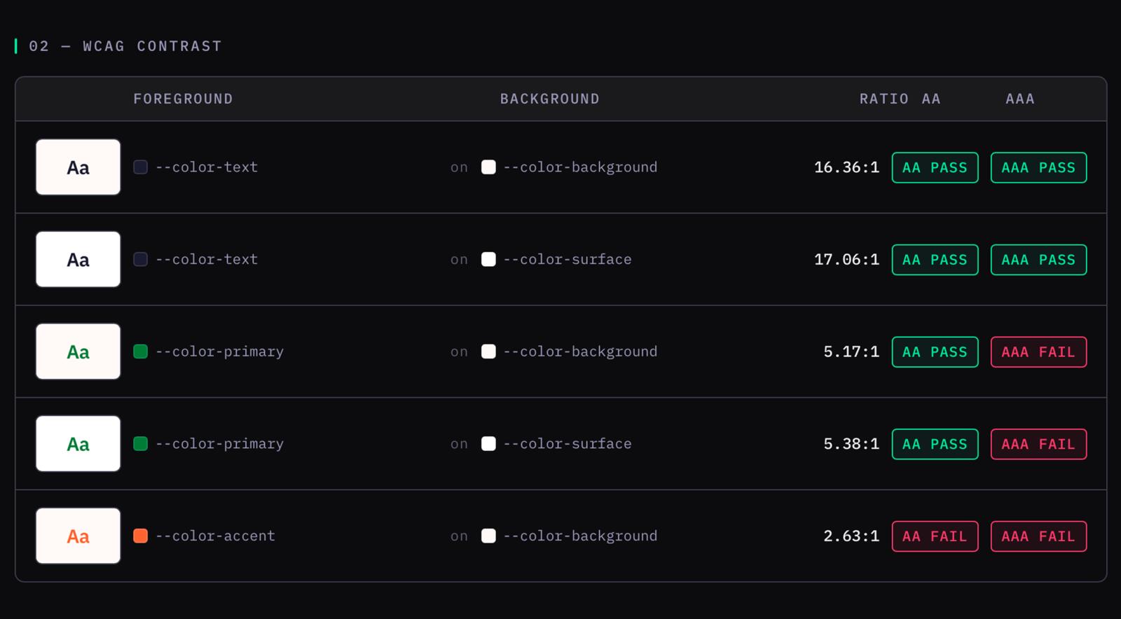
| --vc-muted | #9A9AB0 | Secondary text — 5.5:1 contrast, WCAG AA verified |
| --vc-placeholder | #6E6E80 | Placeholder text — visually subordinate to labels |
| --vc-accent | #00E5A0 | Mint — appears on 5 elements only, earns impact through restraint |
| --vc-border | #2A2A3A | Structural borders — 1px throughout, no decoration |
| --vc-border-hi | #3A3A4A | Hover borders — paired with surface-hi for lift feedback |
| --vc-pass | #22C55E | WCAG pass badge — semantic green, role-specific only |
| --vc-fail | #EF4444 | WCAG fail badge — semantic red, role-specific only |
Iterations
Foundation
Full scaffold. Named presets plus an 8-palette fallback via string hash (djb2). Zero API calls, zero environment variables. Ships to Vercel with vercel --prod from a clean repo.
Readability
--vc-muted lifted from #6E6E80 (3.9:1 — WCAG fail) to #9A9AB0 (5.5:1 — WCAG AA). Added --vc-placeholder as a separate, darker value so placeholder text stays clearly secondary to labels. Fixed a near-invisible connector in contrast rows that was giving ~1.4:1 contrast. Essentially invisible.
Mood layer
Each token now receives a mood word computed from HSL at generation time — not hardcoded per palette. Role-aware: Background maps lightness → Void / Abyss / Depth. Primary maps hue → Danger / Energy / Trust / Focus. Works for any free-text input, not just named presets. Contrast preview enlarged from 11px to 16px 800-weight — actually useful for eyeballing.
Depth and interactivity
--vc-surface lifted to #1A1A22 — cards now visibly float above background. Added --vc-surface-hi and --vc-border-hi for hover states. Token cards and contrast rows both lift on hover at 150ms and 120ms. Hard 1px border-top divider between sections. Color dot indicators enlarged from 10×10 to 12×12.
Try It
VibeCheck is live.
No API keys. No subscriptions. Just describe a vibe and get a semantic token system that passes WCAG — instantly.
Open VibeCheckReflections
The most useful part of this project wasn’t the tool itself — it was the constraint. Five tokens forced every decision earlier than it would have been made otherwise. That discipline is what the tool is actually teaching.
The iteration log is the real artifact. Four rounds of documented refinements with specific contrast ratios and named failures is what separates this from a palette generator. Most portfolio projects describe what was built. This one shows why each version wasn’t good enough yet.